When creating illustrations for your children’s picture book, there are essential tips you must keep in mind to get it ready for design.
Are you an author creating a children’s picture book? If so, then you’re aware that – unlike other genres – your story is more than just text. It’s also told in illustration. The hint is in the genre title, right? Children’s picture books and books told primarily by pictures.
With that in mind, have you decided how your text and your illustrations are going to work together?
At Old Mate Media, we help indie authors get their books completed and published royalty free. Sometimes we help authors right from their first edit, through their illustrations, into design, publishing and marketing. But quite frequently, we work with authors that already have their art and need our help with design first, and then the rest of the journey beyond that.
And frequently these authors haven’t understood the relationship between text and image, and how to best prepare both for design. This can often mean finished images simply won’t work and are either hamstrung or need to be started again. Which is a horrible outcome for all.
In this article, I will walk you through what you need to keep in mind BEFORE you start doing your images. And remember, you can always book in a free chat if you need guidance and help getting started on your children’s picture book journey.
We've also created a video explaining the tips mentioned in this guide. To read the full transcript of the video, click here.

Where will your story text go?
There are three general approaches you can take with the way text is positioned in your book. The method you decide will impact the way you create and submit your images.
1. The adjacent page method:
The easiest method is to have an image on one side of the spread, and the text on the other. This way your image can be all it can be, without being corrupted by the text. The above image shows an example of this approach from a book we did for Terri Wise called The Magical Cupcake Blanket.
Just remember, when you print your book, the cost of production will be impacted not just by the size of your page, but also the number of pages. Therefore, this approach isn’t ideal for long stories. If you have 30 images and 30 stanzas, for example, this would equate to a 60 pages, which is relatively expensive to print.
A slight spin-off of this idea is to have your image go across the spread, but have all the detail on one side, and just background or a splash of colour on the side with the text.
Just remember that in design, we will most likely flip spreads. If the first spread is image on the left page and text on the right. On the next spread it will be text on the left, image on the right. We do this so you don’t have text behind the image, as with cheaper printers (like Amazon) the text can show through.
2. The beside method
Slightly more complicated is having the image and text on the same page, but separate from each other. For example, you may have a portrait book, with a square or rectangular image at the top of the page leaving white space at the bottom for text. This is slightly more complicated in that the dimensions of your image are not set by the book itself, but by your estimate of how much space you will need for the text below (or beside in landscape).
This is why it’s important to get a developmental edit before you begin your images. Otherwise, you may end up needing to increase your story on a certain page (or reduce it) and find out you need different image dimensions after all. Whatever image size you fall on with this method, just stay consistent with the dimensions of your images.
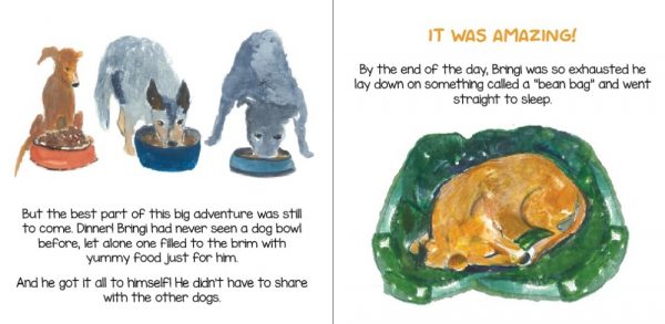
The image above is of a book we made for Tori Cormack called Bringi, and shows text below and above an image.
3. The on-image method
The most complicated approach is to have the text on the image itself. This requires a lot of forward planning. How big will your text be? What font will you use? What happens if you want to add in an extra line – will the text still fit on your image? Is the background bland enough that the text will stand out?
This approach is beautiful and keeps page counts down, but absolutely make sure your book is fully edited and complete before you start as mentioned above. You’ll have very little wiggle room for change at design.
You would be surprised how many times we end up having to put a white box, usually transparent, over the image of a story to show-off the text, because not enough space has been left, or the background is too complicated, for the text to be readable. You can see this approach in the above image from a book we created for Andrea Sanchez called A Realm of Light.
How font choice impacts children’s book design
Fonts can vary greatly in how much space they require to display the same sentence. Or how big you need them to display.
Remember that first and foremost, the goal of text is to be readable. And with children’s picture books, that text is often being consumed by early readers or be elderly grandparents. Fancy and funky fonts – at least for the whole of the story – are best avoided in this regard. You can always just highlight certain words, dialogue or statements for effect in a funky font and leave the rest more traditional.
However, if your approach and style demands a font that’s a bit different, then it may require bigger than normal size and spacing to stay legible. Or it simply may take up more space by the nature of its design.
As such, if you don’t think about that in advance, and then do your art using methods two or three above for your layout, you can get into trouble. It may fit perfectly in Times New Roman, but then be unreadable in that cool kids scribble font you’re after.
Frequently we have authors come to us during the design phase and say, “hey, I want a funkier font,” but it’s too late. Well, unless you start cutting chunks of story out or putting white boxes over the image to make it work. Which isn’t ideal because, remember, this is a children’s picture book.
Never draw your story text into an image
This is vitally important. Yes, it can look awesome if you (or your artist) is talented enough to make your story text look like it is part of the art. Fancy fairy tale style lettering is very romantic, for example. But functionally, it can be very restrictive on your design.
I’m talking about the story proper here. Elements in the image itself, such as shop names or street signs or name tags – things of that nature – are fine. But the story itself should be layered into your book by the designer for many reasons. Namely…
- Images may need to be increased or decreased in size when laid out into your children’s book design. For example, we may need to account for bleed in an image. Or shift an image slightly to keep a key element away from the bind of the book. If the text is in the image, when you change the image size, you also change the text size. This creates an inconsistent reading experience from page to page and makes your book look cheap.
- What happens if you want to edit your story later? Or if reviewers complain about a story element not working or that that the font’s too small? Or too hard to read? Maybe there is an error you missed? Sometimes we even change wording slightly so a book connects better with a sequel. If the text is in the art, you can’t make any fixes or changes to the editorial without redoing the art. That can be costly or impossible if your artist has disappeared off the internet.
- Your book has solid spectacularly and you decide you want a Spanish version, or a German version, or maybe Japanese or Arabic. If your text is in the art, you must redo all the art – especially as the translated text won’t organically fit into the spot you’ve left for it. A designer can’t do it for you, which would be much cheaper.
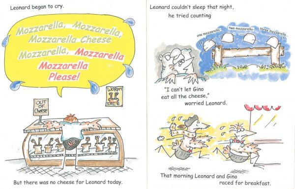
I could go on, but you get the point, right? In the image above you can see an example from a book we are remaking for Ira Walzer called Mozzarella Cheese Please. He wants to change elements of the text and create a digital version, and we’ve had to cut out the text from the images and redo some of the art to make it work.
What about text in digital ebooks
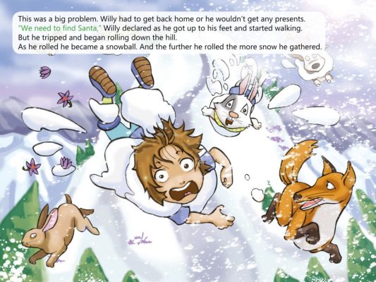
It’s true that dealing with text in eBooks – a fantastic and underutilised medium – is a different proposition. As you can do pop-up text with any font you like – at least in ePub 3 - the space your image takes up isn’t necessarily a relevant concern. Check out the image below for an example of pop-up text in our book Christmas Chimney Challenge from the The Wild Imagination of Willy Nilly series.
However, the fact that Kindle – the biggest storefront for digital books – is an archaic format focused on novels over children’s books, means that in most cases you’re better off keeping to the principals of print.
Indeed, the cheapest and most efficient way to convert your print book to digital is to stick with a similar layout to print. However, depending what size and shape book you’ve gone for, and how much text you have, we may make some changes to ensure your text is readable on a screen potentially as small as an old phone.
We also often work with people who have print books published long ago that want a digital version, so don’t let the fact you’ve got old books put you off. Get in touch and chances are we can still help you get an old print book published and live as an eBook, too.